

Written by Dianne Frisbee
When it comes to branding, identity is everything.
I mean this figuratively. Branding is everything because it’s extremely important. Identity is how a company communicates its purpose to the world. Identity informs how a brand’s employees behave when they’re on the job. And identity influences how a customer feels about interacting with the brand.
However, identity is everything in a literal sense. It’s a company’s logo. The font they employ. The colors they choose. The tone of voice used in their commercials. Even an email signature is a part of a brand’s identity.
With the advent of Web3 and the metaverse, brands are facing an entirely new virtual frontier of branding. Creating a clear brand identity in virtual reality will be just as important as creating a brand identity in this reality.
So what do you do if your brand is having an identity crisis?
To be best prepared for the future of design, we're taking a look back with People & Artifacts - A Design Deep Dive. This series examines at the history of design through the lens of the most influential artists and transformative mediums. In this edition, we’re profiling five innovators in brand identity and sharing the lessons they imparted.
These designers straddled the business and art worlds and created some of the most indelible images in the last century.
Paul Rand - Modernist Maestro
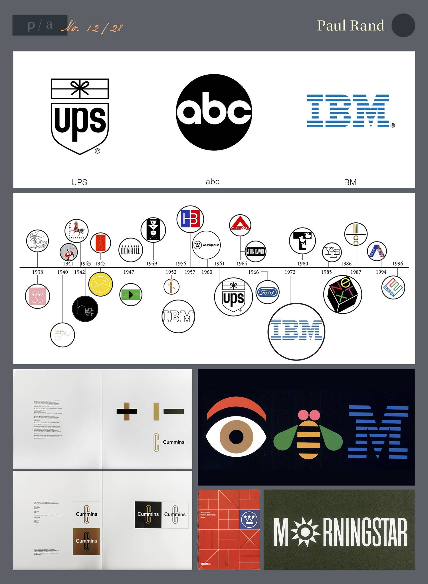
Notable Works: IBM, ABC, UPS
Bio
Described as one of the most influential graphic designers of last century, Paul Rand was born Peretz Rosenbaum in 1914 in Brooklyn, New York. Rand studied art at The New School for Design, the Art Students League, and Yale. Despite his lengthy academic career, one of the biggest parts of Rand’s education came through reading European magazines. Influenced by the work of Laszlo Moholy-Nagy and Cassandre, he brought the sensibility of European modernists to American commercial art.
If you removed Rand’s work in brand identity, he’d still have an amazing resume. At the age of 23, Paul Rand served as the art editor of Esquire magazine, and he later taught graphic design at Yale. However, his most enduring impact has to be his logo designs that almost reinvent the word iconic. From ABC to IBM to UPS, his work is still recognizable and influential several decades after their creation.
Style, Impact, and Observations
Rand's Logo Presentation books, which were created to take the client through his process, are the stuff of legend. Rand believed that the expert chooses the best solution, so he did not present multiple logo options but only his best idea. Here's Steve Jobs talking about how he asked Rand to show some options for the NEXT logo.
That's right, Rand quickly dismissed Steve Jobs' request for multiple options. Steve Jobs! That's shows an artist confident in his ideas.
One of Rand’s influences, Laszlo Moholy-Nagy, praised Rand’s style, writing “He is an idealist and a realist, who uses the language of the poet and the businessman.” Paul Rand was able to create harmony between the commercial and artistic worlds in a way that was practical, yet beautiful. Rand translated the avant-garde into something corporate-friendly.
As with other designers on this list, Rand was a believer in modernism, expressed through his simple and clear design. Speaking to the meaning of modernism, Rand defined it as "Integrity, honesty, absence of sentimentality and absence of nostalgia, it is simplicity, clarity. That's what modernism means to me..."
Through color, typography, and media, Rand tried to “defamiliarize the ordinary” with his work. This led to design that communicates a clear message through recognizable symbols, text, and a stroke of cleverness. He approached graphic design as universal medium, stating that “simplicity and geometry are the language of timelessness and universality.”
Resources:
https://www.famousgraphicdesigners.org/paul-rand
https://americanart.si.edu/artist/paul-rand-3936
https://www.grapheine.com/en/history-of-graphic-design/paul-rand-everything-is-design
http://idsgn.org/posts/steve-jobs-and-paul-rand-the-impact-of-confidence/
Massimo Vignelli (1931-2014) - Italian Identity Impresario
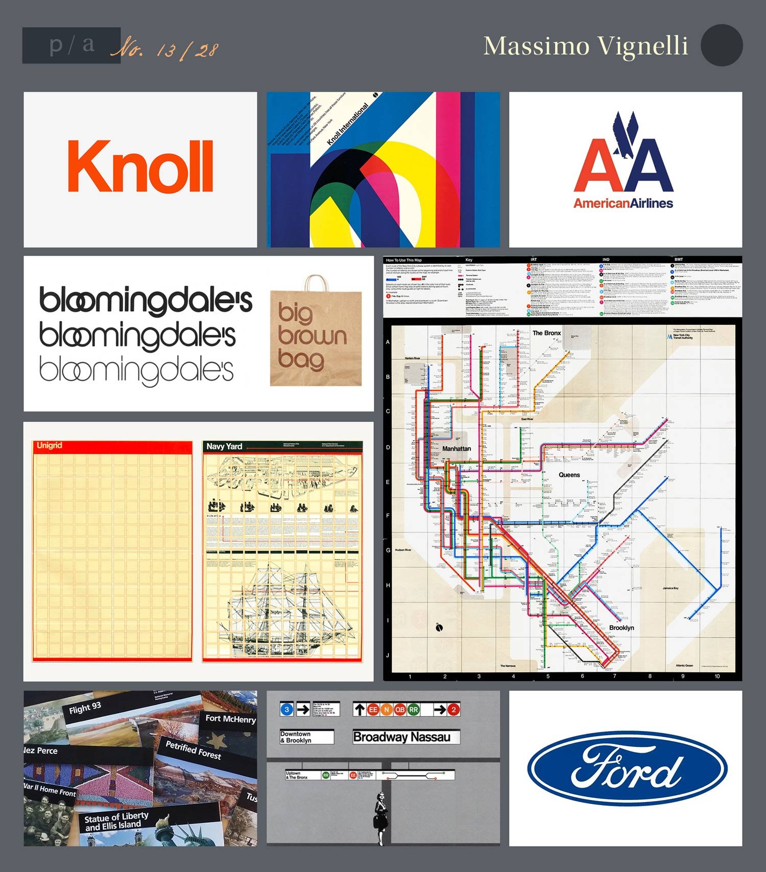
Notable Works: American Airlines, Bloomingdales, New York City Subway Map
Bio
Another advocate of modernism in graphic design, Massimo Vignelli studied architecture at the University of Milan and University of Venice. After visiting America on a fellowship in the 1950s, Vignelli moved to New York to work at Unimark International. During his tenure, Unimark became one of the leading design firms, as Vignelli created corporate identities for companies such as American Airlines and Bloomingdales. Vignelli also designed the New York City Subway maps and signage while at Unimark.
As the company grew, Unimark’s focus shifted away from design and towards marketing. This prompted Massimo to leave the company and found Vignelli Associates with his wife, Lella.
Beyond his work in brand identity, Vignelli is also famous for being one of the main forces behind the popularization of Helvetica.
Style, Impact, and Observations
While Paul Rand believed that “good graphic design was equal to fine art,” Massimo Vignelli was famous for saying “Design is not art. Design is utilitarian, art is not.” Vignelli worked through logic, subtracting away anything that was unnecessary to the design. This logical approach is exemplified in how he saw the grid as the fundamental basis of graphic design.
He believed that good design featured “no meaningless decoration,” and he placed an emphasis on the end user’s needs.
Ultimately, Vignelli’s designs are a masterclass in simplicity.
Vignelli Associates utilized only four fonts towards the end of Massimo’s career: Helvetica, Garamond, Bodoni, and Century Expanded. Vignelli explained, “Out of thousands of typefaces, all we need are a few basic ones, and trash the rest.”
The power of simplicity may best be seen in his approach to the New York City Subway map. Vignelli took an unwieldy nest of winding subway paths and untangled them into their pure essence: a system of dots and lines. This ended up not only branding the subway system, but New York City itself, where the Helvetica signs are still synonymous with NYC.
Resources:
https://inkbotdesign.medium.com/massimo-vignelli-biography-of-the-famous-graphic-designer-6eaba10a4ca6
https://mymodernmet.com/massimo-vignelli-design-is-not-art/
https://en.wikipedia.org/wiki/Massimo_Vignelli
http://www.designculture.it/interview/massimo-vignelli.html
William Golden - Putting the Eye in Identity (1911-1959)
Notable Works: CBS
Bio
The youngest of twelve children, William Golden grew up in New York. During a brief stint in Los Angeles after graduating from school, Golden worked in the Examiner’s art department. In the 1930, Golden returned to New York, eventually landing at House & Garden magazine at Conde Nast. This is where he met his wife Cipe Pineles, who we profiled in (MAGAZINE LINK HERE).
In 1937, William Golden started his career at CBS, a company where Golden would create a lasting impact. However, shortly after being promoted to art director, Golden took a leave of absence to join the military during World War II. In 1941, he worked for the Office of War Information before joining the Army as a private. During his time with the military, he art directed army training manuals in Europe.
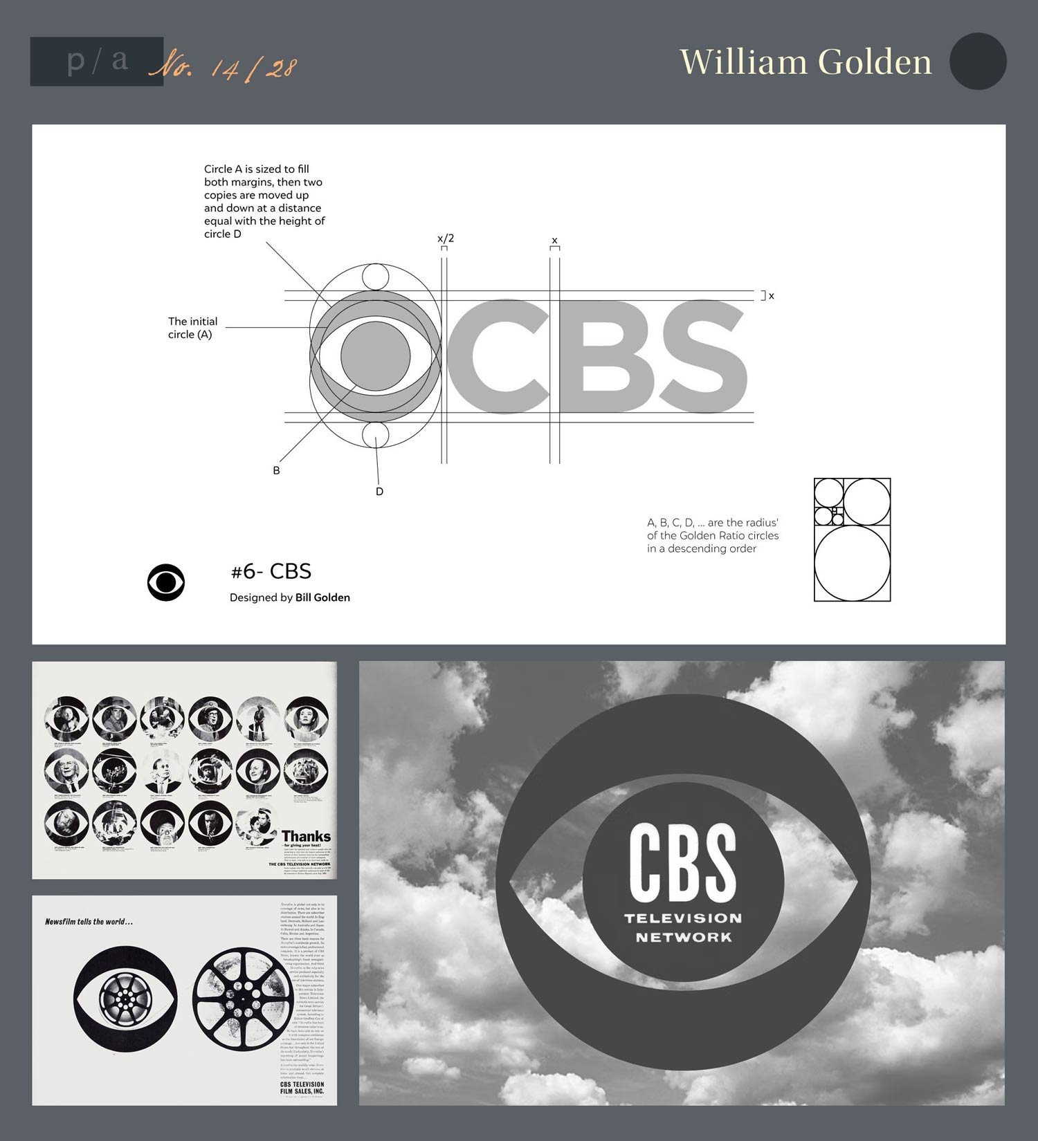
After the war, Golden returned to CBS as it was shifting from radio to television. During this critical time, Golden was the “chief architect of CBS identity” as he created one of the most enduring pieces of brand identity ever: the CBS eye symbol.
Golden passed away in 1959.
Style, Impact, and Observations
CBS President Frank Staton nicely summarized Golden’s goal for the designs he created for CBS, saying, “Everything we produce at the Columbia Broadcasting System, including our own printed advertising, reports, documents, and promotion is carefully considered from the viewpoint of the image we have of ourselves as a vigorous, public-spirited, profitable, modern enterprise. We give the most careful attention to all aspects of design. We believe that we should not only be progressive, but look progressive.”
Essentially, a brand’s identity needs to look like what the brand represents. Not only what a brand does, but what a brand’s ideals are. What a brand strives to be. This is as important to communicate to employees of the company as it is to their audience.
Golden was an especially effective designer for this purpose. His work was clear, bold, and versatile, working equally well as a station logo and as printed promotional material. Talking about the Eye logo, Golden said, “I am grateful that it is such a versatile thing that there seems to be no end to the number of ways it can be used without losing its identity”
Combined with the use of a proprietary iteration of the Didot typeface, Golden gave CBS an identity that exuded “extraordinary taste and intelligence,” both to CBS’ executives and the general public.
Just months before his untimely death, Golden called for designers to have a sense of responsibility.
"...I happen to believe that the visual environment of advertising improves each time a designer produces a good design—and in no other way. We tend to overstate our case in the most complicated manner, and to confuse the simple purpose of our perfectly honest, useful, little craft with the language of the sociologist, the psychiatrist, the scientist, the art critic and sometimes even the mystic. The obvious function of a designer is to design.”
Resources:
https://en.wikipedia.org/wiki/William_Golden_(graphic_designer)
https://www.commarts.com/features/pioneer-william-golden
https://go.distance.ncsu.edu/gd203/?p=50236
http://adcglobal.org/hall-of-fame/william-golden/
Lou Dorfsman (1918-2008) - CBS Company Man
Notable Works: CBS
Bio
The child of Jewish immigrants from Poland, Lou Dorfsman has several things in common with William Golden. They both grew up in New York. They both served in the Army during World War II. And they both worked for CBS after the war.
In 1946, Dorfsman joined CBS as Golden’s assistant. Golden was Dorfsman’s hero and mentor. When the company divided the Television and Radio divisions, Golden took over TV, while Dorfsman became art director for CBS Radio. While some would have despaired at being assigned the “dead-end medium,” Dorfsman leapt at this opportunity. He took “unglamorous” small space print ads and produced hundreds of “ingenious gems… All of them unflinchingly and entertainingly make the case for CBS Radio.”
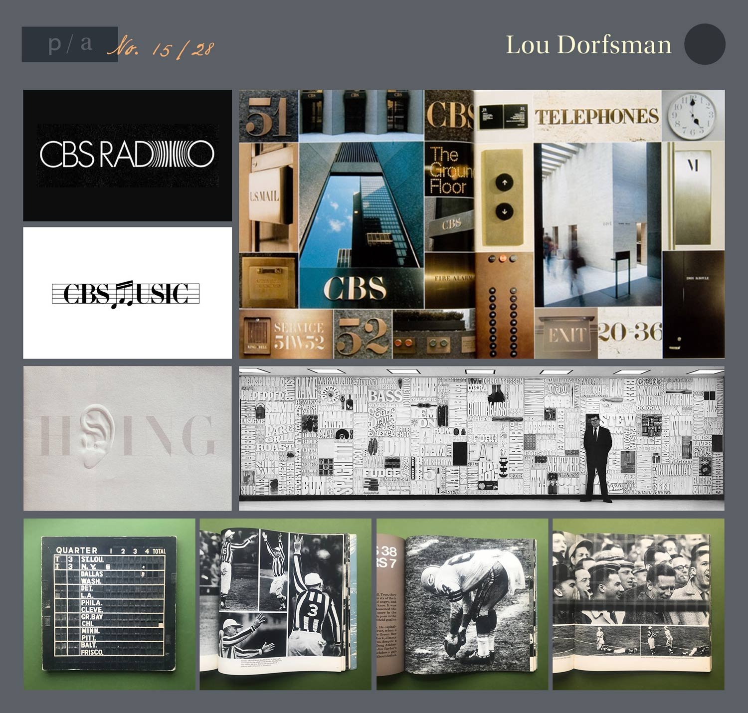
After Golden’s death in 1959, Dorfsman became creative director for CBS Television. He continued to work for the company for the rest of his career, rising to senior vice president and creative director for marketing communications and design for all of CBS. When CBS moved to a new headquarters in 1965, Dorfsman created what he considered to be his magnum opus and gift to the world: the Gastrotypographicalassemblage. This 35-by-8.5 foot work of art listed all of the cafeteria’s culinary offerings in three dimensional wood type, and now can be found at the Culinary Institute of America.
Dorfsman retired from CBS in 1987, after more than 40 years with the company.
Style, Impact, and Observations
Dorfsman faced the unenviable task of filling the shoes of a legendary designer who also happened to be his hero. However, Dorfsman extended the legacy of Golden through his use of the CBS Eye and CBS Didot font, and Dorfsman made an impact through “conceptual clarity, provocative visual presentation,” and his own unique style.
Dorfsman’s designs were described as featuring “clear typography, simple slogans and smart illustration.”
Dorfsman also saw everything that CBS did as an opportunity to strengthen the brand’s identity. He took responsibility for everything from CBS’s “advertising to the paper cups in its cafeteria.” In CBS’s headquarters, he ensured that the CBS Didot and CBS Sans fonts were utilized everywhere in the building, from the door numbers to the elevator button to the wall clocks.
During the 1960s, Dorfsman also created commemorative books celebrating CBS’s NFL broadcasts and moon landing coverage. These books became collectors’ items, as well as reinforcing the association CBS has with important national events in the public consciousness. The NFL book even helped CBS secure an important NFL broadcasting contract, which still remains an important part of the network’s portfolio.
Resources:
https://designobserver.com/feature/the-four-lessons-of-lou-dorfsman/7507
https://www.nytimes.com/2008/10/26/nyregion/26dorfsman.htmlhttps://en.wikipedia.org/wiki/Lou_Dorfsman#cite_note-NYTObit-2
https://en.wikipedia.org/wiki/Lou_Dorfsman#cite_note-NYTObit-2
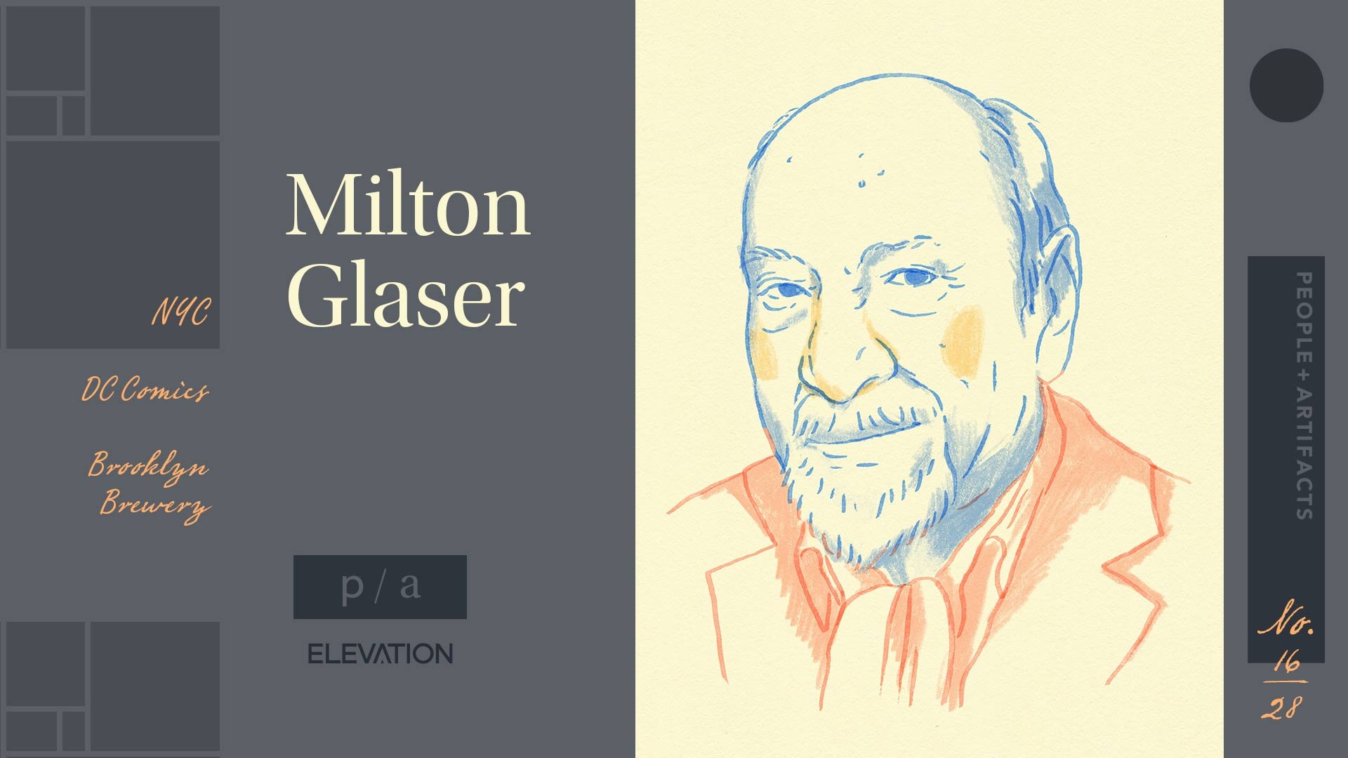
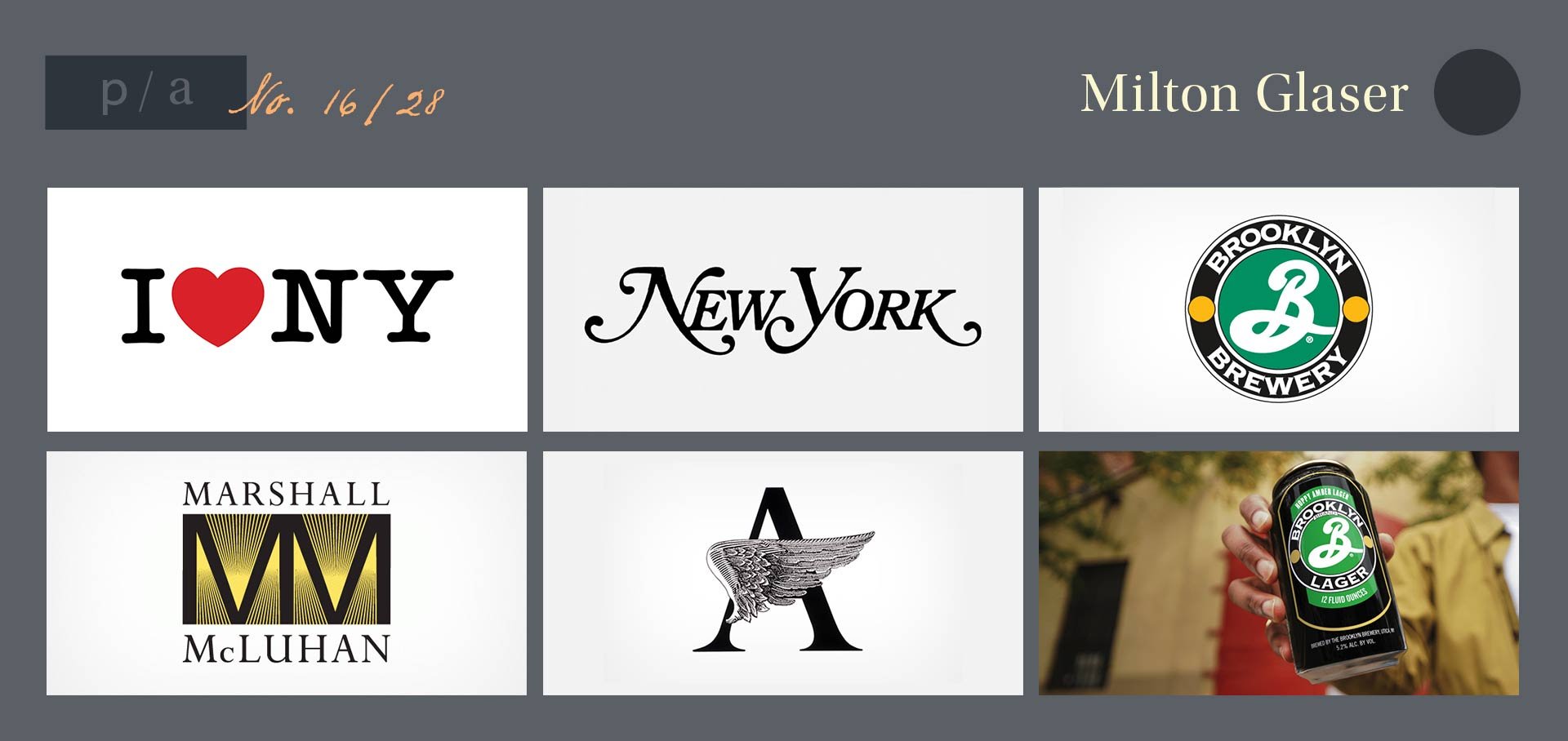
Milton Glaser (1929-2020) - I ♥ Design
Notable Works: I ♥ NY, DC Comics, Brooklyn Brewery
Bio
Like Lou Dorfsman, Milton Glaser grew up in New York and was an alum of Cooper Union. In 1954, he founded Push Pin Studios, which was said to have “redefined and expanded the imprimatur of the designer, illustrator, and visual culture at large.” While working at Push Pin, Glaser designed the poster for Bob Dylan’s Greatest Hits. This was one of the first posters he designed, and he went on to illustrate over 400 more posters. Glaser also designed ten typefaces, cofounded New York Magazine, and started his own firm, Milton Glaser Inc, in 1974.
Glaser’s most recognizable work in identity is the I Love New York logo. New York State turned to Glaser in 1977, when crime was high and tourism was low. This logo became ubiquitous, described as “a global meme subject to endless variation.” Glaser also created the logos for DC Comics and the Brooklyn Brewery.
Milton Glaser was the first graphic designer to be awarded the National Medal of the Arts. He received the award from President Barack Obama in 2009.
Style, Impact, and Observations
While this list has featured some modernists who embraced Swiss simplicity, Glaser bucks that trend. Here’s graphic designer Paula Scher, describing the legacy of Push Pin Studios:
“The work combined eclectic, often historic typography with illustrations that were idea-based, not nostalgic. They were the antidote to ultra-clean, heavily organized Swiss Modernism, which was the language of big corporations. Milton Glaser was the leader of the pack because he was as articulate as he was visually talented.”
The Cooper-Hewitt National Design Museum honored Glaser with a lifetime achievement award, saying he “mixed together commercial art and fine art to create a potent new language.”
While Vignelli disdained ornamentation, Glaser embraced it. He said “All the things that the doctrine of orthodox modernism seemed to have contempt for — ornamentation, narrative illustration, visual ambiguity — attracted us.”
His style oozed intelligence and whimsy, and Glaser drew upon the rich history of art itself to inform his work. “We were excited by the very idea that we could use anything in the visual history of humankind as influence. Art Nouveau, Chinese wash drawing, German woodcuts, American primitive paintings, the Viennese secession and cartoons of the ’30s were an endless source of inspiration.”
Resources:
https://www.nytimes.com/2020/06/26/obituaries/milton-glaser-dead.html
https://www.cooperhewitt.org/2020/06/29/milton-glaser-1929-2020/
https://en.wikipedia.org/wiki/Milton_Glaser
People & Artifacts - A Design Deep Dive
Artist profile illustrations by Tonia Yiu.
Be sure to check out the other entries in this series covering the history of design.