
Written by James Grosch
M&M’s made a mess last week, and for once it’s not because I dropped some in the seat of my car and forgot about it. The Mars company unveiled a refresh of their lineup of brand mascots. The M&M characters underwent a redesign to be “more inclusive” and better reflect “today’s society.”
Sounds good so far, right?
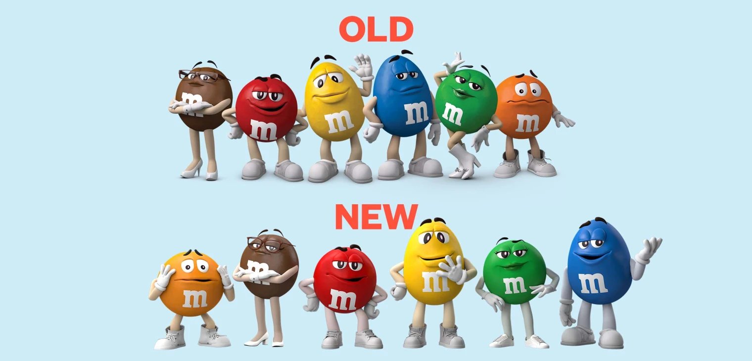
Until you compare the old design of the characters to the new designs.
Like a toddler whose had too much chocolate, the internet went wild mercilessly mocking the M&M’s rebrand.
While initial public reaction and internet memes aren’t everything, this is a case of good intentions meeting flawed strategy and execution. Which is extremely unfortunate, because I’m a huge fan of the M&M’s brand and product — as anyone who has been to a movie with me can attest.
Today, I’m going to go beyond the hard-shell of the backlash against this rebrand and dive into the chocolately center to see what lessons can be learned from this character kerfuffle.
1. Focus on Your Core Values
One of the prevailing reactions to this rebrand is “Who asked for this?” Was making the M&M characters more inclusive a problem that needed to be solved? Like I said earlier, I believe there were good intentions behind this change. Inclusivity and diversity are two much-needed qualities. It’s been great to see all the different ways companies have embraced inclusivity over the past few years.
But was inclusivity or diversity something that anyone thought about when they looked at a lineup of sentient pieces of chocolate?
One of the big problems with this rebrand is the incongruity between M&M’s messaging and their core brand values. Most major publications focused on the how M&M’s positioned this rebrand as reinventing their mascots for a "more dynamic, progressive world.” In a similar vein, Mars also said that Green M&M and Brown M&M will be a "force supporting women,” and that Green’s change specifically "better represented to reflect confidence and empowerment, as a strong female, and known for much more than her boots."
All well-intentioned, but the emphasis on it feels out of sync with the candy company’s core values. When I think of M&M’s, I think of fun, tasty treats and special times of togetherness. I don’t think of seeing society reflected in their characters. Some are finding the messaging as disingenuous or cringy because it doesn’t feel like an organic extension of their brand values.
Reading the press release, I believe there are some really great ideas focusing on fun and belonging that do feel like they fit the M&M’s brand. “M&M's has long been committed to creating colorful fun for all… Everyone has the right to enjoy moments of happiness, and fun is the most powerful way to help people feel that they belong.” Mars would have been better served pushing this as the primary messaging behind the rebrand, as moments of happiness that promote belonging perfectly fits the candy company’s product.
Unfortunately, the media narrative became focused on the other parts, resulting in headlines like “M&M’s characters are getting a new look to become more ‘inclusive’” and “The M&Ms Characters Are Getting the Progressive Rebrand Literally No One Asked For.”
When approaching your rebrand, always ask if the reason behind it feels like an organic extension of your company’s core values.
2. Make Sure Your Design Choices Support Your Mission
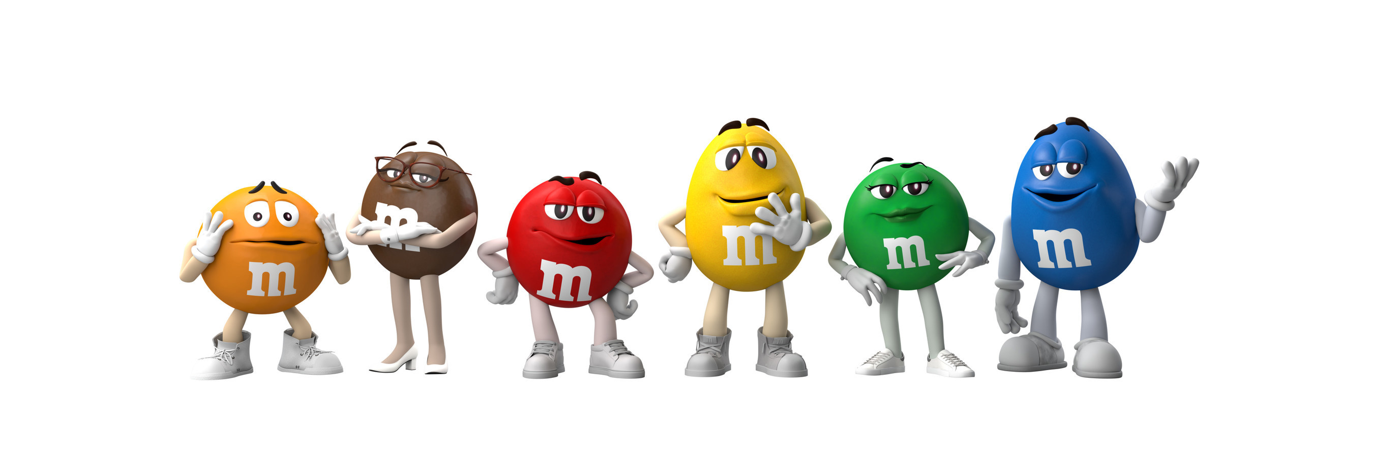
Another big reason this rebrand has received a backlash has to do with the design language not matching the publicly-stated goals. Mars’ mission for this redesign was to make their characters reflect a “more dynamic and progressive world.” However, the biggest visual change is that each character has new shoes. It undercuts the sentiment behind the rebrand and fueled criticism online.
That’s why it is so important to understand that every aspect of your rebrand — what you change and what you keep the same — will communicate something. Be sure to take a holistic approach to your rebrand and ensure that every detail, from font to color to character design, supports your overall mission.
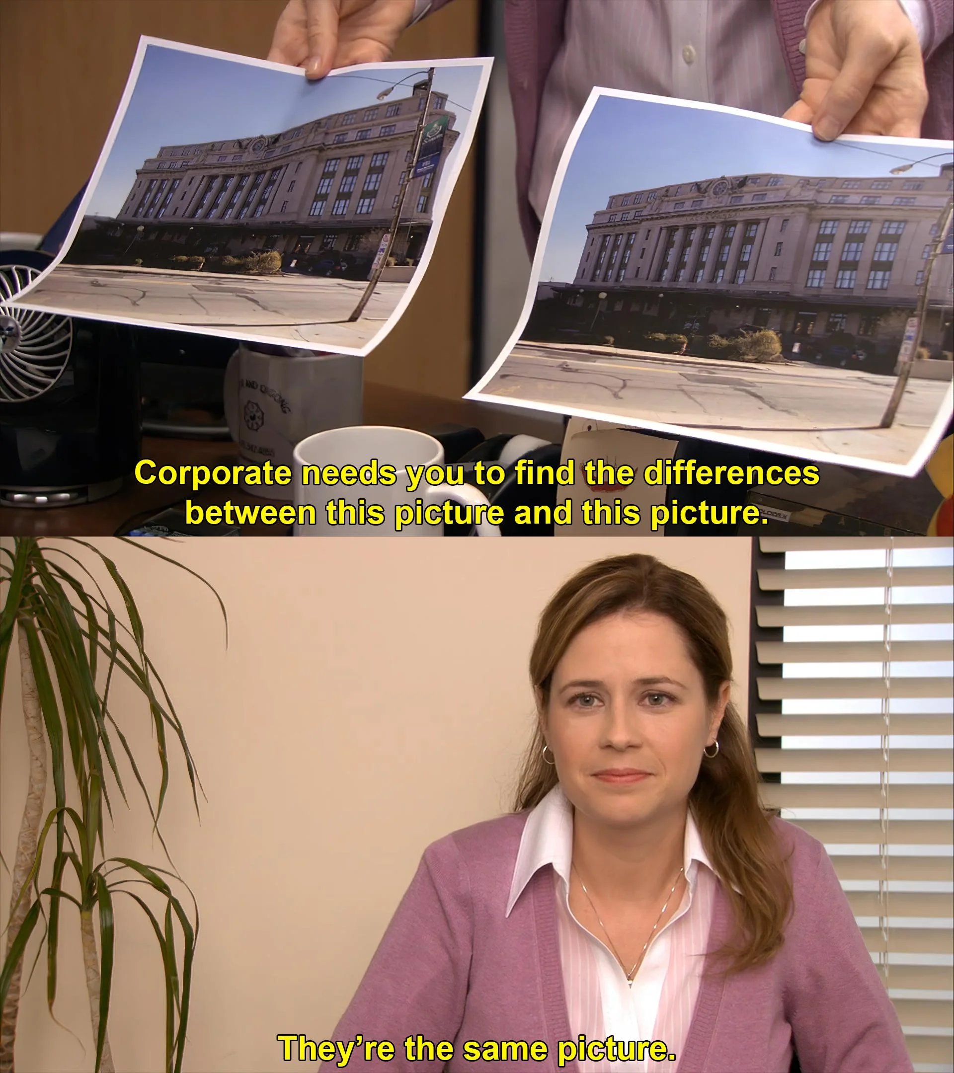
3. Don’t Oversell a Subtle Change
Once again, I need to show you a before and after picture of the M&Ms characters.
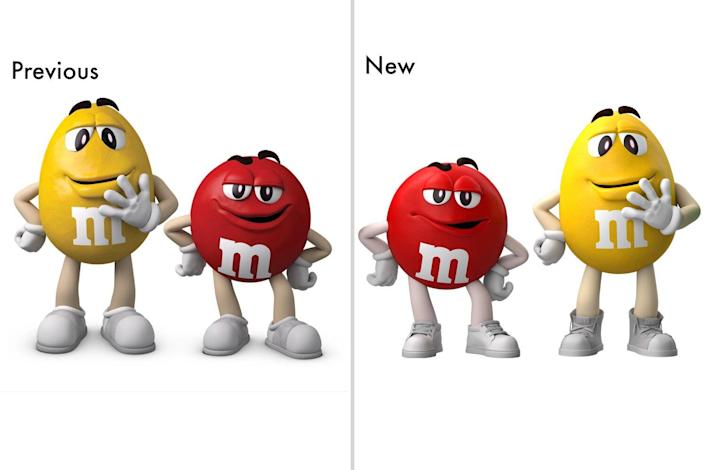
It feels like this iconic and heavily meme’d moment from The Office.
In defense of M&M’s, there’s more to a character reinvention than how they look. The characters have new backstories and new writing that will reflect this new direction. For instance, Red will be less bossy, and Orange will acknowledge his anxiety. But even those are subtle differences.
The big lesson here is to not oversell a subtle change. The M&M’s characters underwent a light character refresh. They look the same, and their personalities are very similar to what they were before, but some aspects have been changed to better appeal to modern audiences. M&M’s should have made all of the same changes, but not focused their PR so heavily on the character redesigns.
It ultimately undercut the well-intentioned message of their rebrand, creating a narrative messier than candy that melts in your mouth and in your hand.
Topics: rebrand/refresh development