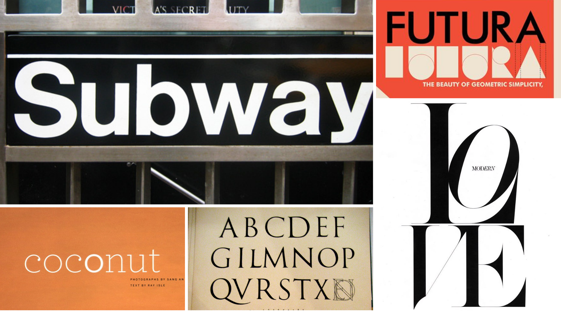
5 Fonts Every Designer Needs to Know

Written by Dianne Frisbee
I love fonts. Currently, Font Book on my Mac says that I have 1,419 fonts on my computer. And that doesn’t even count what I have installed with Adobe Cloud. To say that I have a passion for fonts might be an understatement.
So asking a font enthusiast to pick their favorite fonts is like asking a parent to choose a favorite child. …If they had thousands of children.
As a designer, fonts are an essential tool for telling your brand’s story. “Everything communicates,” like the saying goes, and that especially applies to the fonts a brand chooses to use for anything they put out into the world. When picking a font, I not only consider how it looks, but also its history, its origin, and its unique cultural, social, and even economic driving forces. Every font has a distinct personality.
As tough as it is to narrow down, here are five fonts that I consider essential to know. Some of these are very popular, which means that they get overused, resulting in backlash and strong opinions. However, I still identify these as unique and beautiful, as well as having substantial impact on Graphic Design.
I’m going to dive deep into the history, personality, and unique impact each of these fonts have, drawing on my experience as an Art Director.
1) Helvetica
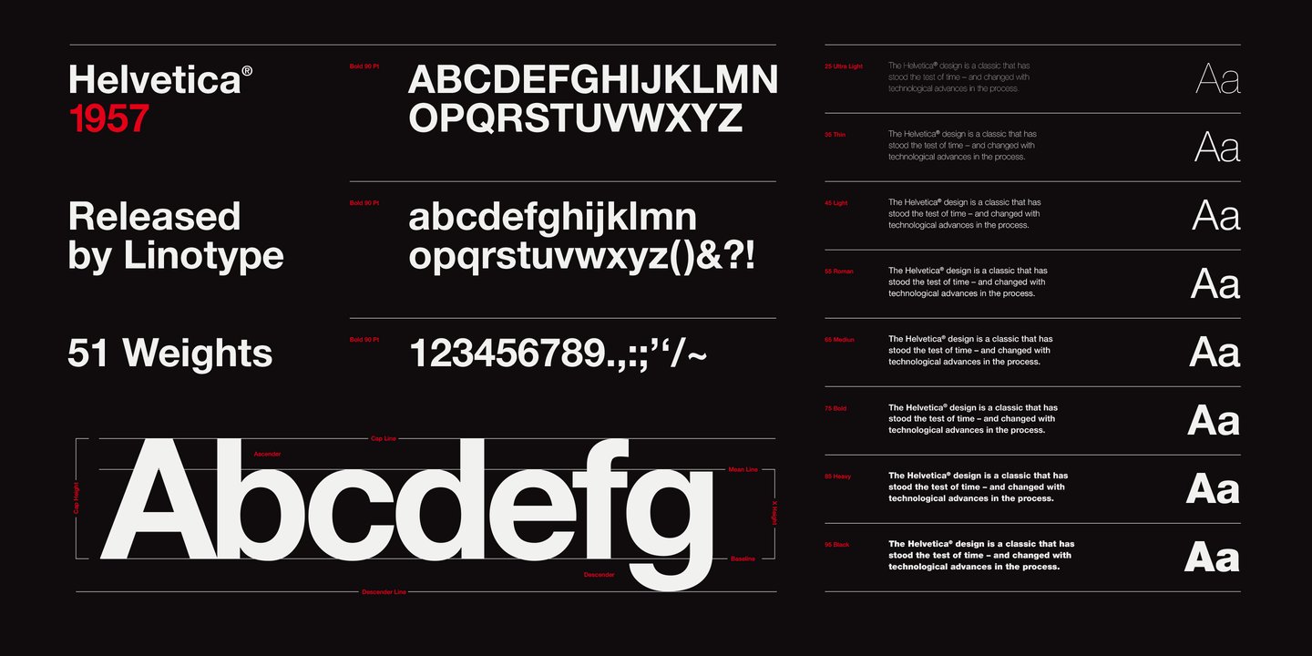
Helvetica was based off an 1896 font called Standard in the US and Akzidenz-Grotesk in Germany. The sans-serif typeface was an avant-garde font of the 1920’s International Style that emerged at that time as a modern departure against calligraphic or blackletter type. Standard featured streamlined, geometric shapes.
The font that we know now as Helvetica was created in 1957 by Swiss typographic designers, Max Miedinger and Eduard Hoffmann.
It has gone through at least two updates with Neue Helvetica and, most recently, Helvetica Now; but this font remains grounded in the International Style and Bauhaus principles of being neutral and versatile.
On a personal note, Helvetica was the designated brand font for my alma matter, The College of Design at NCSU, so it holds a special place in my heart for that reason.
Font personality:
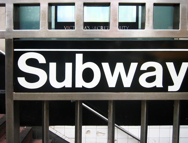
Helvetica is known for its utter lack of personality. Legendary designer, Massimo Vignelli, used Helvetica for the New York Subway system specifically because it was legible and not expressive. The font feels accessible, clear, and direct.
2) Trajan
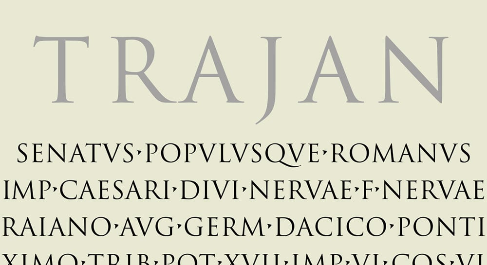
I feel like Trajan gets a bad reputation because it was overused in the early 90’s, specifically with movie posters. As one of Adobe’s early default fonts, this font was accessible to anyone with the software. Trajan did not take off initially, but it grew at a slow burn until it reached saturation by showing up in everything from Titanic to The Last Samurai. It took us to outer space in Apollo 13 and even a galaxy far, far away in Star Wars Episodes I - III. As far as fonts go, Trajan doesn’t seem to be bound by any particular genre.
Trajan is inspired by the first-century imperial Roman capitals chiseled into the Trajan column in Rome. Released in 1989 by Adobe, it was the first font to digitize the ancient Roman letter designs.
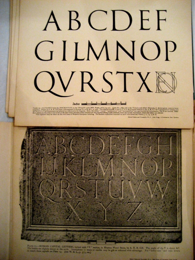
As a history buff, I think it is cool that the constraints of chiseled letters in stone yielded such timeless forms.
Font personality:
Classic, Elegant, Monumental, Gravitas
3) HTF Didot
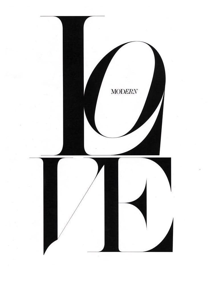
Didot is based on the Modern, Neoclassical style typefaces from Parisian designer Firmin Didot (1764-1836). Both Didot and the font Bodoni are sometimes referred to as Didone style. They are serif fonts with extreme contrasts between their thick, bold strokes and skinny little serifs. They were a departure from Renaissance era ‘old style’ fonts and were on trend 250 years ago.
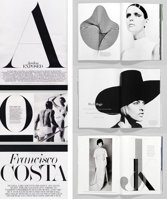
My relationship with this fashionable serif was with Harper’s Bazaar magazines in the 1990s. Liz Tilberis and Fabien Baron were the magazine’s Art Directors responsible for commissioning Hoefler&Co to update the classic font for exclusive use in the magazine. As I was just starting design school during this period, these editorial designs were perfect examples of art combining text, message, and form into one punch.
Hoefler&Co’s update honored the design’s thin hairline serifs by creating seven different “optical sizes” to ensure that the detail wasn’t lost at smaller sizes.
Font personality:
Balances softness and strength, classicism and modernity. Didot is all about the extreme contrast of the thick and thin characteristics that make it stand out. This font has become synonymous with luxury and fashion brands.
4) Futura
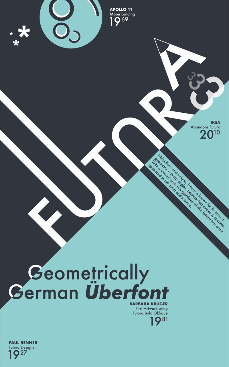
If you are looking for a sans-serif font with more personality than Helvetica, think about Futura. Like Helvetica, it was born from the geometric sans-serif designs of Bauhaus in 1927. The ideology behind Bauhaus was based on simple, modern, and functional geometry. The font focuses on consistent, even-width strokes that eliminate contrast.
Futura feels forward thinking, with its rounded lowercase letters, distinct longer ascenders, and straight-legged “R”.
If you are a fan of Wes Anderson films, you are familiar with Futura as a character in The Royal Tenenbaums, where it was used almost exclusively for any on-screen type from titles to background elements.
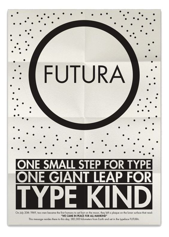
Another interesting bit of font trivia is that Futura was used as the typeface on the commemorative plaque that was left on the moon by the astronauts of Apollo 11.
Font personality:
Modern, forward-looking, highly legible, slight vintage feel
Modern, forward-looking, highly legible, slight vintage feel
5) Archer
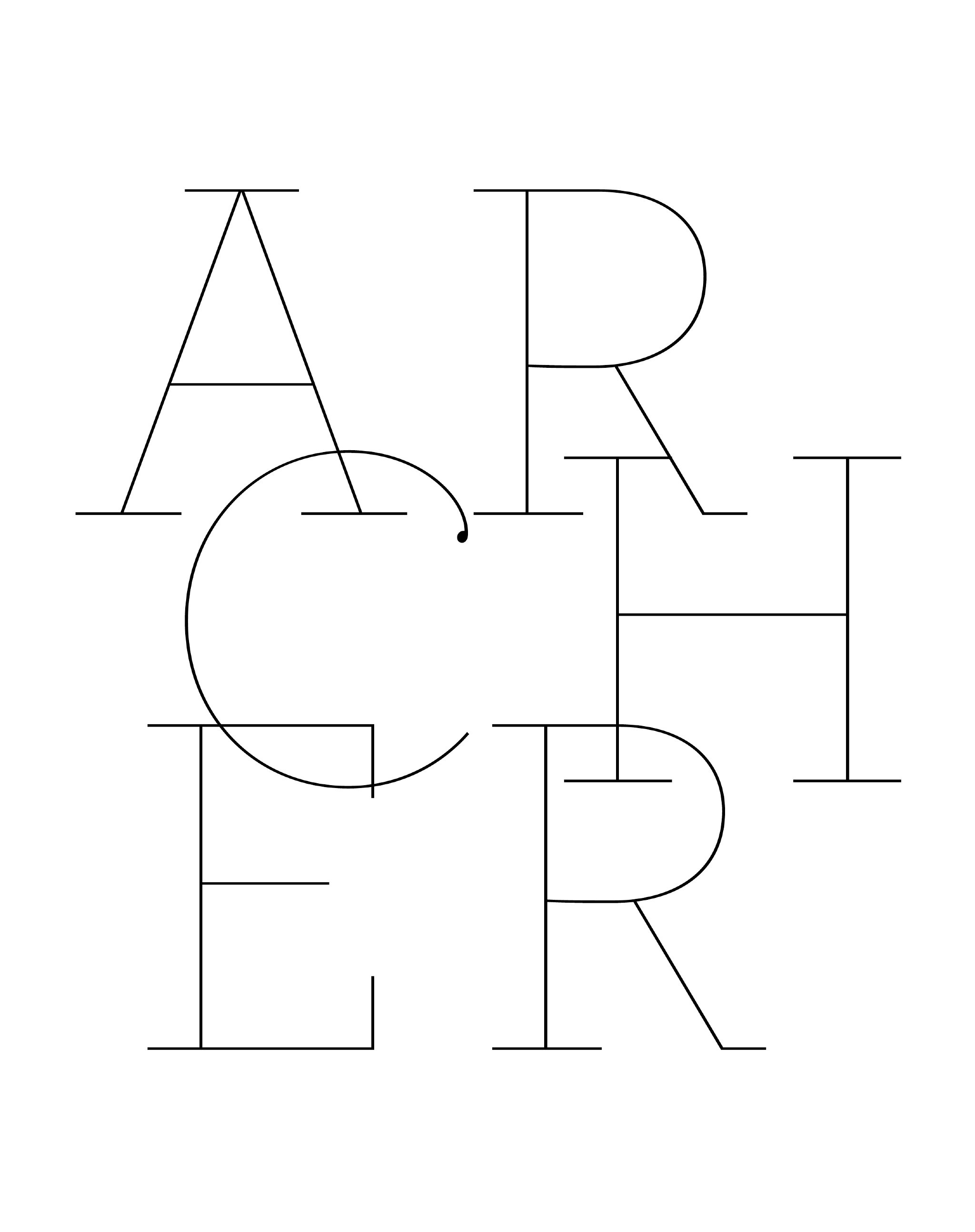
Enter the slab serif font! The complete opposite of Didot’s thin serifs are a slab serif’s squared-off, blocky terminals that give a sturdy, almost workhorse feel. Slab serifs are typically used as display fonts because of their heavy, dramatic appearance.
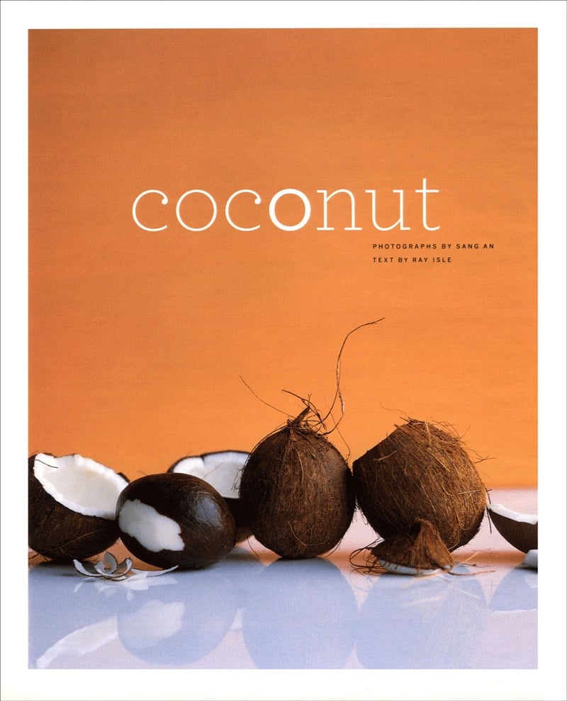
Archer was created in 2001 for Martha Stewart Living magazine by Hoefler&Co, and made public in 2008. It was inspired by the rationalist thinking of Geometric Slab Serifs where the O’s are circular rather than elliptical. This font also takes some of its cues from the world of typewriter faces, like Courier. This mix places Archer in the category of Humanist style, because it shows some roots in calligraphy while also containing some contrast.
Font personality:
Friendly without being silly, easy to work with, inviting to read, hard-working, personable - yet frank.
Understanding the history, personality, and versatility of these five essential fonts will give you a great foundation as you discover more about how a typeface can help you communicate in powerful ways.
Topics: visual storytelling
