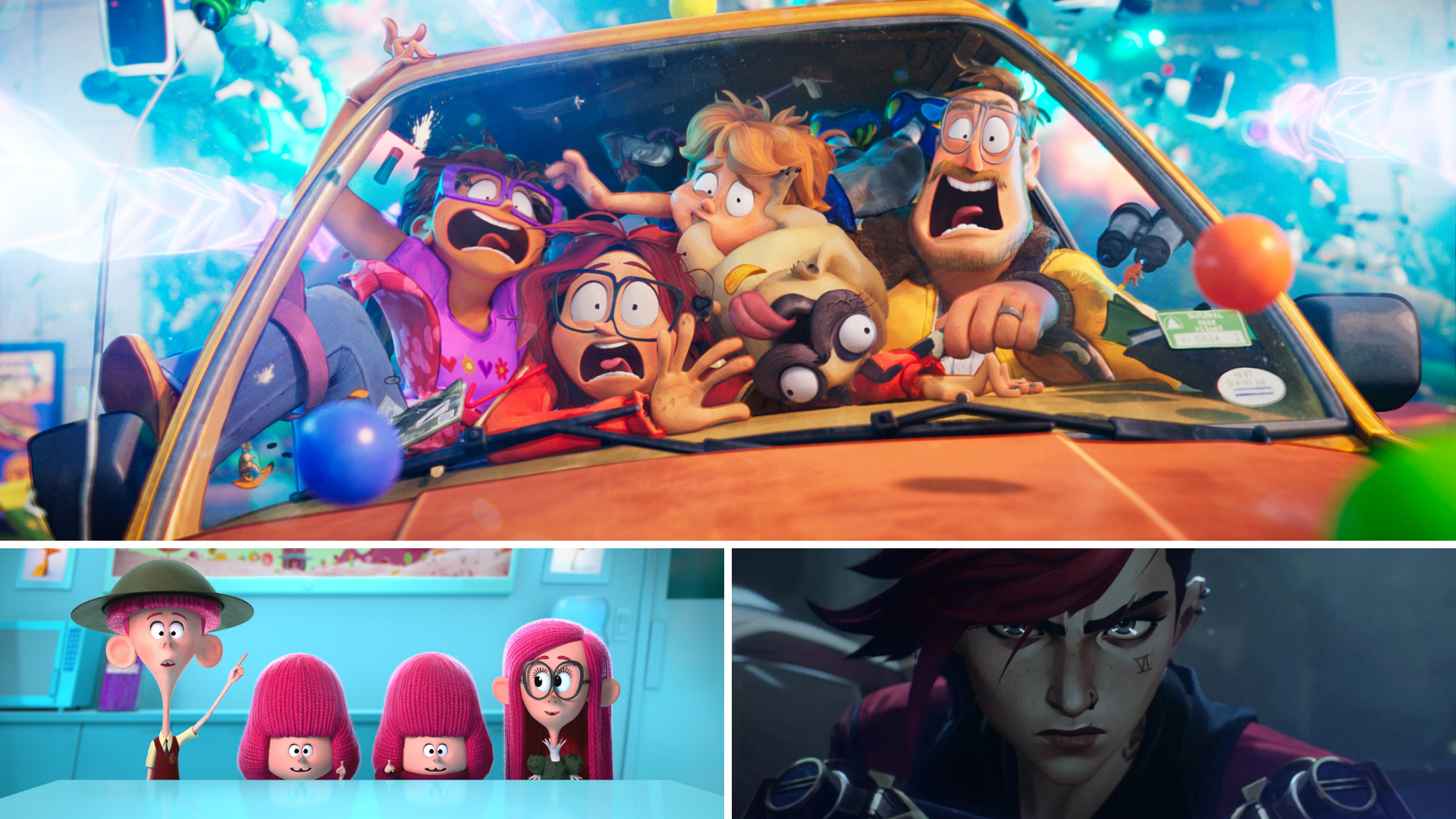
Style Over Realism: The Latest 3D Animation Trend
Written by Sean Kiley
We are on the other side of the uncanny valley.
When 3D animation first arrived, artists and studios raced towards photorealism. For a long time, many would judge advancements in 3D technology on how real it looked. From video game cutscenes to the latest blockbusters, progress toward 3D realism popped its head up to show off its newly rendered face. As computer processors and 3D software got more advanced, better lighting, cleaner modeling, and more detailed texturing became the standard. Even in the cartoonish world of Pixar and Dreamworks, the caricatured models are textured with life-like surfaces. I still look back at the bread in Ratatouille with amazement.
At some point, we were told, "it's here!" But as we looked upon the newest face of photorealism, something wasn't quite right. The absorption of light into the surface, the pores on the face, the liquid in the corner of the eyes, the peach fuzz, it was all there. Our reaction?
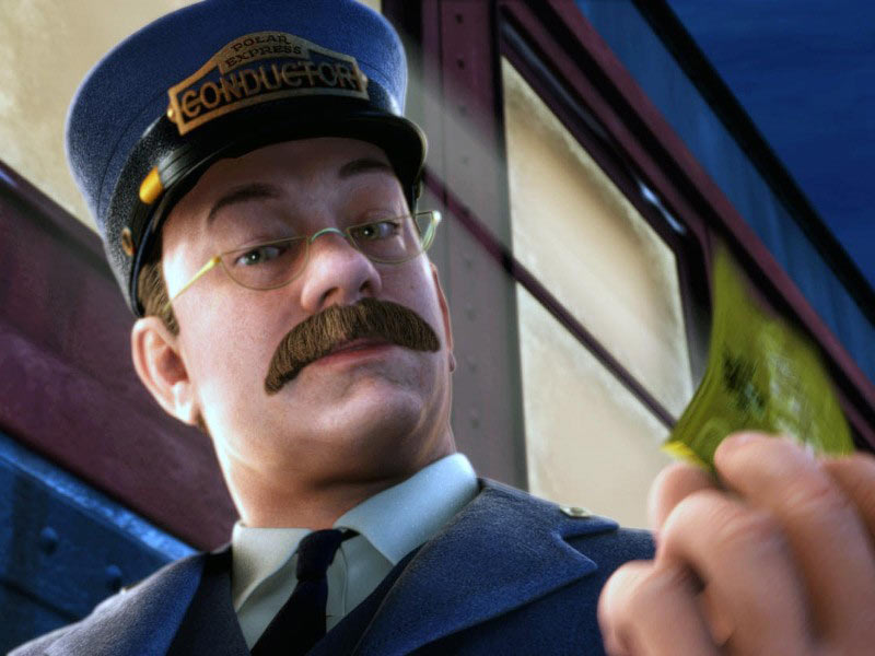
What's wrong with that dude's face?
Why style is starting to beat realism in 3D animation
Turns out a couple decades of R&D isn't enough to fool millions of years of evolution. We'd officially entered the uncanny valley, a name coined to describe the scenario above where life-like 3D renders still register to us as fake.
Today, the march goes on. While realistic 3D will always have its uses and appeal, there has been a mainstream effort recently to break free of it. Creating a unique look for 3D is nothing new, but it was limited to shorts and independent animation. Always on the side stage, but never ready for prime time. Think of the Disney shorts Paperman or Feast.
However, some of the most popular releases of the past few years have been some of the most stylish. This trend makes sense. Stylized 3D animation doesn't risk falling into the uncanny valley, because it is showing its audiences things they've never quite seen before. Style has also become an important differentiator. For a long time, the world of animated features all had a somewhat similar aesthetic, as studios chased the early success of Pixar. But now, artists are able to flex a bit more and deliver 3D that makes their film or series stand out from the crowd.
In this post, I'm going to share a few examples of major animations that successfully push the boundaries of 3D with their unique styles.
The Mitchells vs. the Machines: 3D That Doesn't Look Like 3D
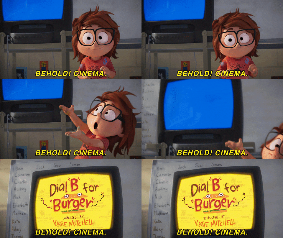
Academy Award nominated The Mitchells vs. the Machines is a hilarious family adventure. The style of the film completely fits with the personality of its silly and high-energy characters.
Sony Pictures Animation created proprietary techniques to make the 3D look LESS 3D. The visual direction was to try to make the animation seem more illustrative. To do this, they generated marker outlines on top of the characters, added brush strokes to textures, and simplified how objects were rendered in the background. One of the nicest touches was the 2D animations overlaid on top of the 3D. The animators plastered hand drawn, cartoony passes of wobbly, childish scribbles all over their expensive 3D renderings.
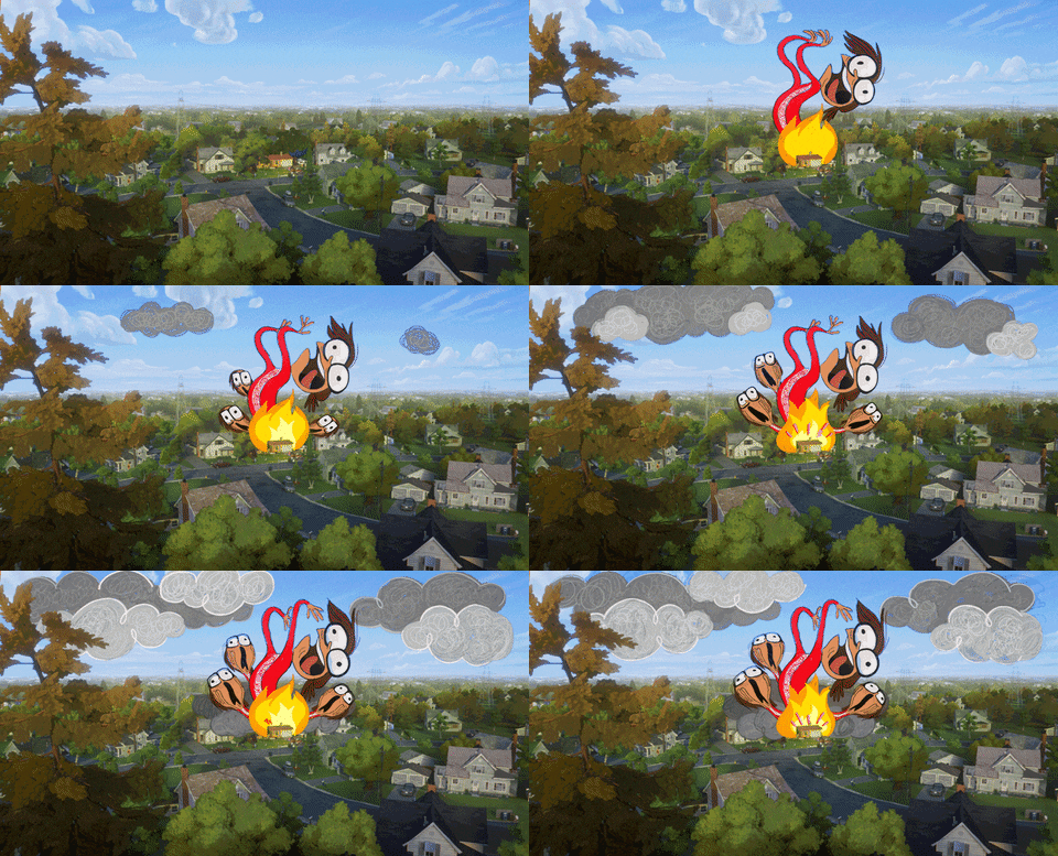
Producer Chris Miller recently talked about how their studio is moving away from the idea of a standard house style. "These movies can look like anything you want them to. The limit is your imagination... Find the idiosyncratic thing that's how you see the world, and that's what's interesting. That's what's so great about this medium."
"We're right on this cusp right now where we're sort of smashing the idea of a house style," Chris Miller, Producer of #MitchellsVsMachines, discusses the limitless possibilities with animation at Variety FYC Fest: The Producers. https://t.co/3ohea9tZb1 #VarietyFYCProducers pic.twitter.com/B4OFjy4nUn
— Variety (@Variety) February 26, 2022
The result is a film that delivers as much on style as it does on story.
Arcane: Painterly 3D Style That Packs a Punch
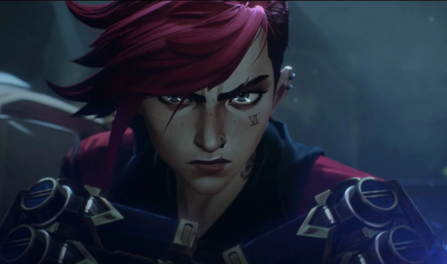
Arcane, one of Netflix's most popular animated shows, is another example of superb style.
You'd be forgiven if you saw a frame from the show and thought it was a digital painting. In a way, it kind of is. Developed by Riot Games, Arcane explores the world that serves as a backdrop to their popular game League of Legends. To create this animated series, Riot went to French studio Fortiche, who has developed a unique painterly style with their 3D animation.
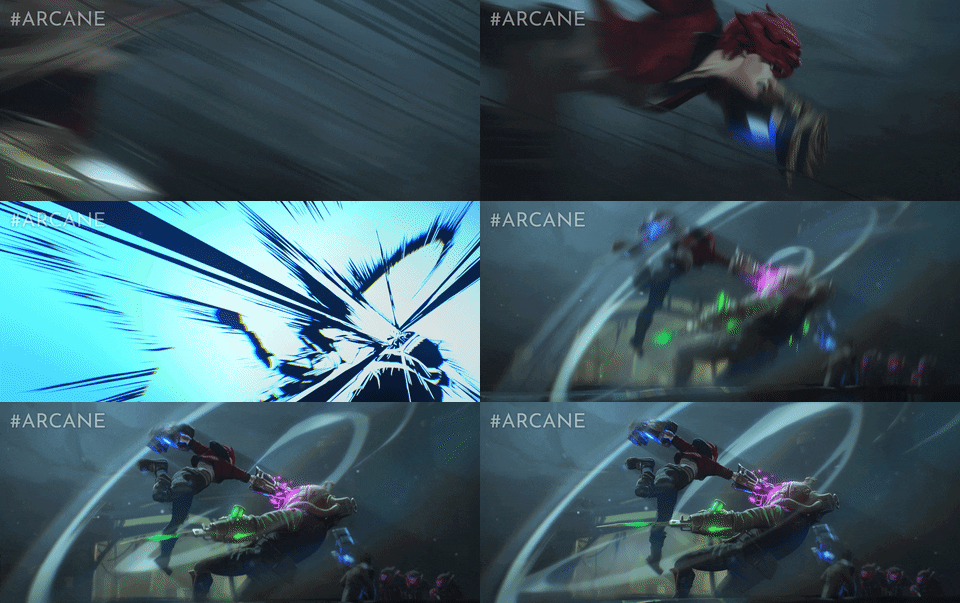
To create the look for Arcane, Fortiche relied on their talented illustrators to create backgrounds for the animation instead of modeling and texturing full 3D environments. Not only is this much less expensive, it also allows for the painterly style of the series to be realized. To fit the characters into this world without feeling out of place, they too were given painterly textures.
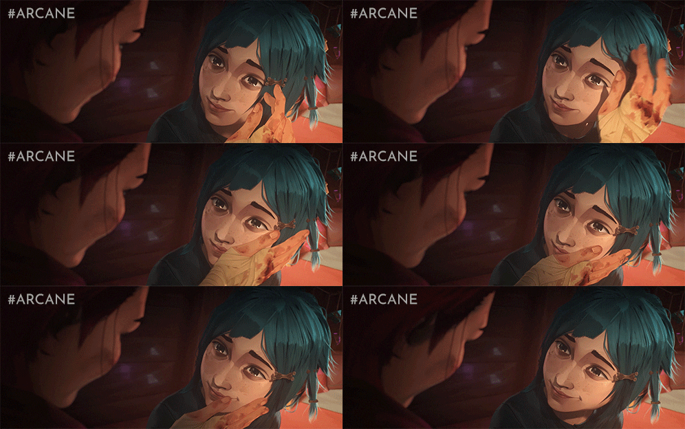
This is done unapologetically. Closeups of characters or props reveal individual brush strokes, even highlights painted right on to the models.
The Willoughbys and Hotel Transylvania: Style Through Texture and Movement
In the first two examples, you could get a good idea of the style of the movie from a still frame. But animation is also about how things move. The next two examples are great examples of how texture and movement can push the bounds of stylized animation.
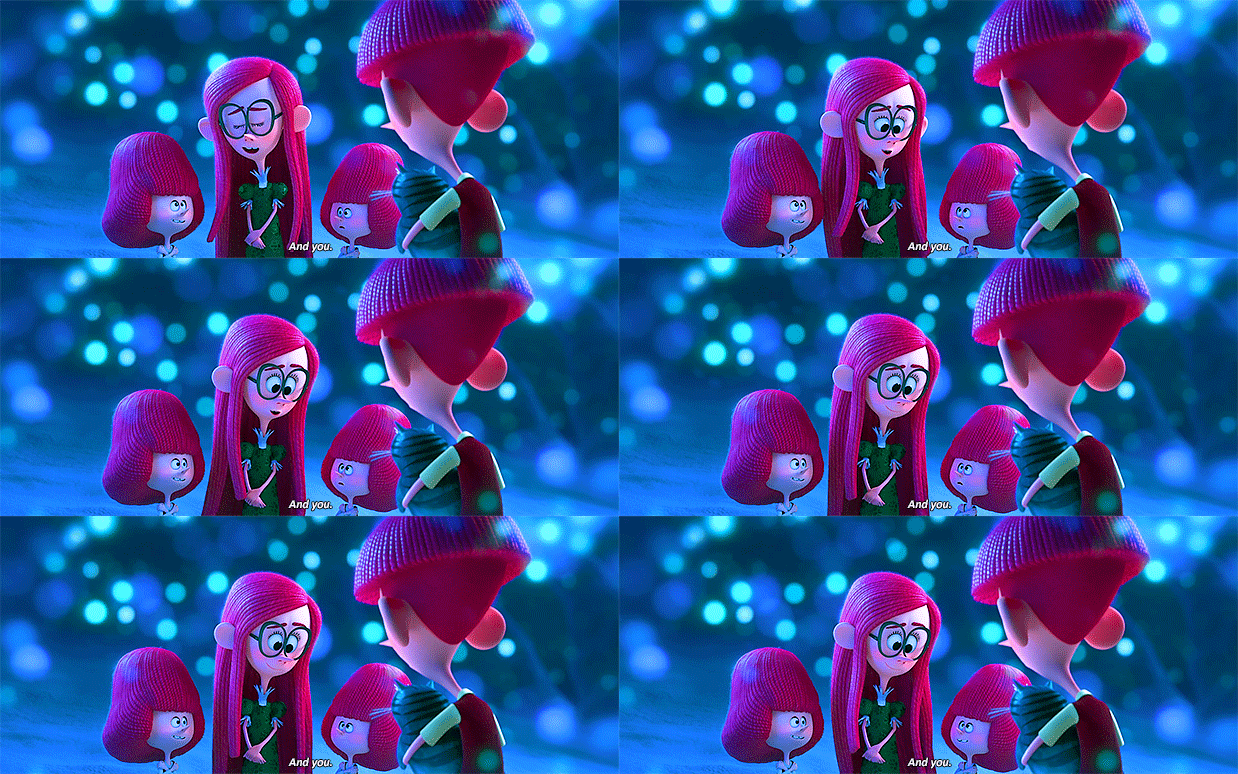
The Willoughbys is another Netflix original with a unique style that evokes stop motion animation. The characters are even rendered with stop motion texturing, with hair that looks and acts like it's made out of yarn. Everything is animated at a lower frame rate to give it a feeling of classic stop motion movies like The Nightmare Before Christmas or Coraline. Of course, this isn't a limitation of their rendering software, but a deliberate stylistic choice.
Style can go beyond light and texture. The Hotel Transylvania series is a great example of style through movement. Director Genndy Tartakovsky brought classic animation principles like stretch and squash to his 3D characters.
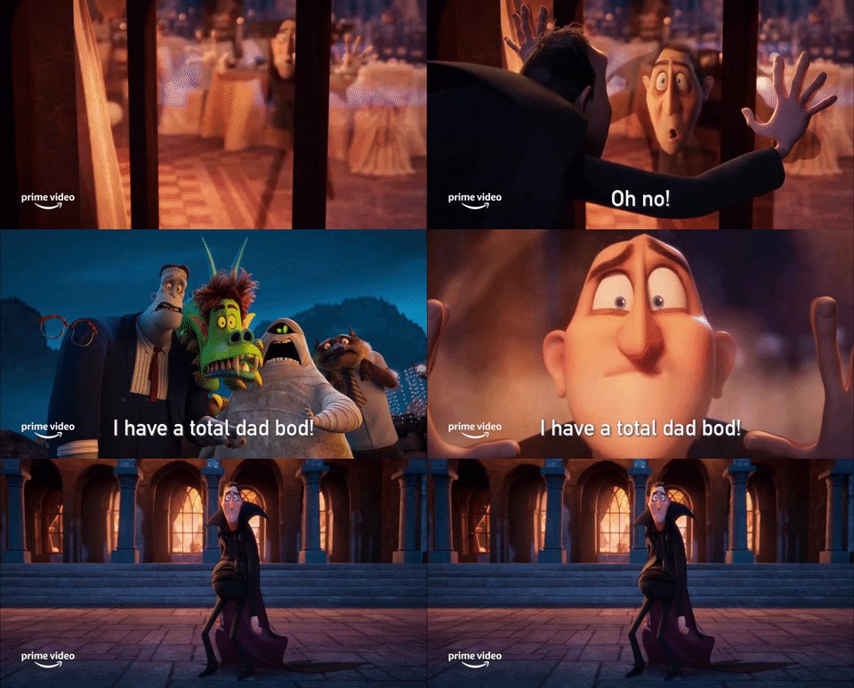
The Hotel Transylvania series is packed with 3D characters that move in very 2D ways. They often come to an abrupt stop while talking, or have mouths that move in super exaggerated ways. This stylistic choice is a perfect fit for the comedy of the series, as the movement evokes slapstick staples like Looney Toons.
The Future of 3D Style
Undoubtedly, we will see more stylish 3D in the future. What will it look like? If recent trends continue, it will be a blend of modernizing older styles and techniques while creating something completely unique.
Whether it comes from large studios who feel like it's now a safer choice or from smaller studios who will be given chances to shine, it's nice to be on the other side of the uncanny valley.
Topics: Animation, visual storytelling
