

Written by Dianne Frisbee
To paraphrase Charles Bukowski, “Style is everything.” It is the non-verbal clues that tell others about yourself. Even if you don’t think you have a style, your non-style is communicating on your behalf. Every choice is deliberate. Colors and shapes evoke common emotional responses within a culture. For example, blue, the color of the sky and sea, is calming and is frequently associated with depth, stability, sincerity and trust. This is why we see debate stages dominated by the color blue. Whereas yellow, the color of the sun is most often associated with feelings of happiness or friendliness.
Know Your Brand
Designing a logo and full brand identity are a little like creating a dating profile. Your logo is that first impression that will introduce your company to potential customers. It is important to write down and define a clear brand identity. This should include what makes your brand unique and what beliefs and values are important. Think about what three words you want your customers to use to describe you and use these to craft your brand’s core personality.
Also check out our article on 'Elements of a brand' (Rebrand vs. Brand Refresh) – we break down how to develop what we call your "brand core".
Design: Your Visual Decoder Ring
It is time to start translating your brand into visuals. All design choices will be measured against the brand’s personality, and there are lots of elements to curate. Typography, colors, shapes, line styles, and textures, all add up into a design aesthetic.
Design Aesthetics
There are myriad design aesthetics, but here are some broad guideposts to help you start narrowing in on yours: Classic, Vintage, Modern, Minimalist, Playful, Handcrafted.
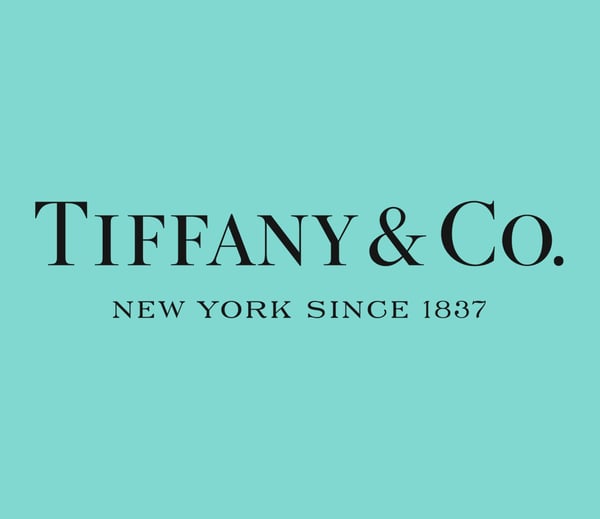
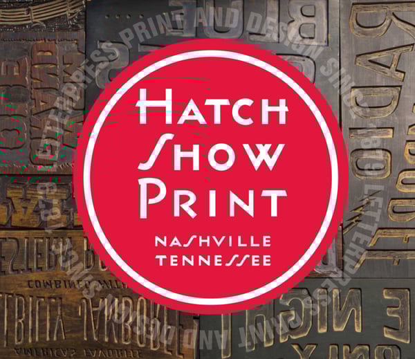
Classic
What makes something Classic?
Classic keeps things simple, relatable, and should feel timeless. Trends come and go but classic design aesthetics withstand the test of time.
Brand examples:
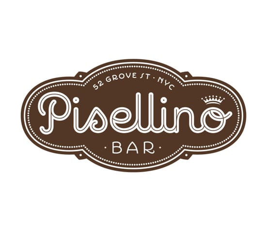
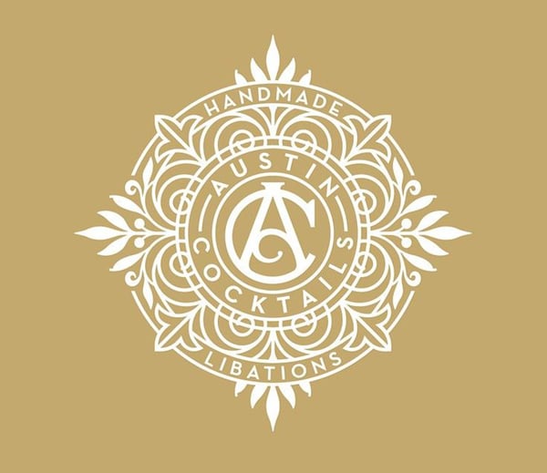
Vintage
Vintage designs are rooted in history and evoke a sense of nostalgia. For centuries we've been pulling design trends from previous eras and this helps shape how we want new designs to be perceived.
Brand examples:
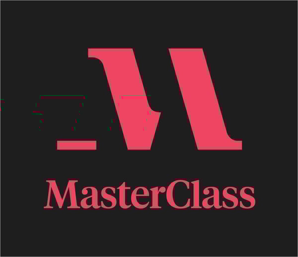
Modern / Minimalist
Modern and Minimalist design aesthetics come from the early 20th century, artistic movement of Modernism. At that time there was a desire to depart from tradition and embrace experimentation and industrialization. The streamlined, minimal details of these designs say that your brand is forward thinking and easy to navigate.
Brand examples:


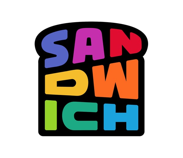
Playful
Fun, quirky, and playful designs convey a sense of whimsy and promote a friendly, positive vibe through unexpected color palettes and non traditional typography.
Brand examples:
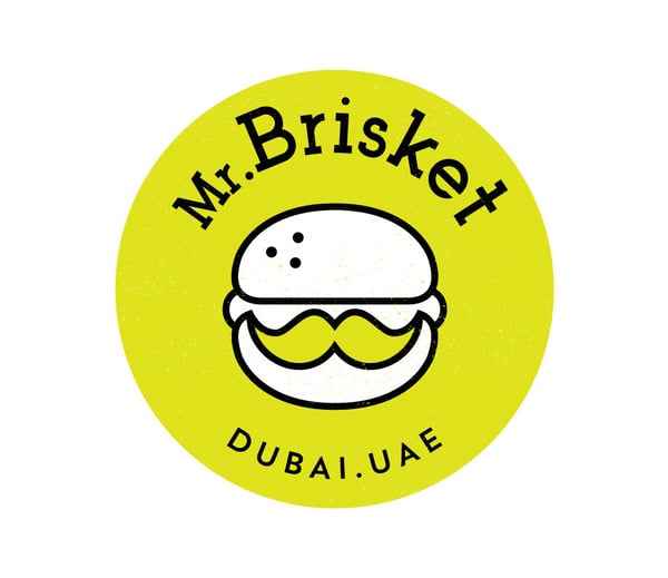
Handcrafted
Handmade or Handcrafted qualities can really distinguish a brand from its competitors. They feel personal and individualistic.
Brand examples:
Rarely is a design a singular aesthetic. Mixing and pulling elements together helps create a new, unique expression.
Design: The Elements
The context and history of your brand elements play into the overall meaning. For example, the psychology behind color is complex and each hue can have multiple meanings. Take some time to read up on color theory to be sure your choices are aligned with and not fighting against any messages you want to convey.
Color Theory
Aside from each color’s emotional qualities, how colors get combined impact their sensory experience. There are three general standards in picking colors from a color wheel: Complementary, Analogous, and Triadic.
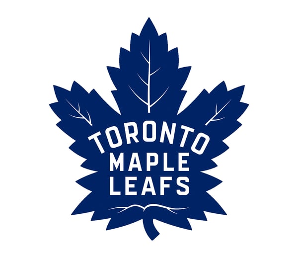
Complementary
Complementary Colors are opposites on the color wheel and make things stand out. Sports teams frequently use complementary colors.
Analogous
Analogous colors are next to each other on the color wheel and therefore are related; creating a relaxed harmonious vibe.
Triadic
A triadic color palette is three colors evenly spaced around the color wheel. It creates a harmonious look with a bit more edge and intensity.
Typography
Typography can bring a ton of baggage to your intention. There are 4 basic categories of fonts: Serif, San-Serif, Script, and Display or Decorative. You can dive deeper into the subcategories of each of the basic four (like slab serifs and Neoclassical under Serif, and Geometric and Grotesque under San-Serif).
General rules are as follows, but everything is flexible when it comes to style:
Serif
Serif fonts are the oldest, commonly associated as the style of hot metal type used in early printing presses. Technology has brought about a legibility debate as the fine serifs don’t translate as well to onscreen viewing and designers are not using it for large blocks of copy.
San-Serif
San-Serif fonts appear more modern than their ornate predecessors. The letterforms are similar, only minus the serifs.
Script
Script typefaces are based on handwriting and feel fluid. They can evoke traditional, elegant calligraphy invitations, or more casual and conversational letters.
Display / Decorative
Display fonts are meant to stand out and vary wildly. Quite literally, these are dynamic fonts used to grab attention for Headlines in pamphlets or print.
Bringing It All Together
The fun starts when you begin combining your elements to create a unique, signature style. Also known as our favorite part! From strategy, to design, to execution, we can help you craft the style that speaks to your brand.
Read more articles along the lines of design and visual storytelling here.

Topics: visual storytelling