

Written by Dianne Frisbee
Trends have been coming and going since the beginning of time. From bell bottom jeans to skinny eyebrows – But what makes something “trendy” and why do some trends tend to stick around longer than others? Why are some trends a blip in time when others are evergreen?
In this blog post we will be discussing what design trends are and why you should care about them.
What Is a Design Trend?
Let’s start out by defining exactly what a trend is: a general direction in which something is developing or changing/ a current style or preference. A trend can derive from random luck because a certain style blew up on social media, advertisements, or another form of art. They can also derive from a specific spike in what clients are seeking out.
Design trends can be, and usually are, heavily influenced by current events and the general public’s current climate. In other words, trends are really great at reading the room. Some trend titles you may recognize are minimalism, responsive design, and vintage.
What Makes a Design Trend Successful
Successful design trends usually build off of basic design principles. Trends commonly build off of something that was already there to catch a viewer's eye in a different but still familiar way. As stated before, trends don’t just come out of thin air, they change as the market changes. For example, when tracing the start of minimalism in technology products, it was Apple’s simple and sleek designs that catapulted this trend.
If a trend is popular enough, it can be like a boomerang, sailing out of sight as times change. But, after a few years, people may start to rediscover it and bring bits and pieces of it back. A good example of a trend boomeranging can be found in the bright colors and wild shapes of a movement like Memphis design. In recent years, minimalism pushed this trend out. But, in the past few years, these bold, colorful designs have become popular again. You can see examples of these styles in our 'The Strategy of Style' blog post. Trendy can be timeless if done correctly. Other examples of trends that have gained second winds are hand lettering, flat design, and wordplay.
Why Are Design Trends Important
Is it important to keep up with design trends? Yes! By understanding trends, you can offer clients innovative ideas and help them understand how to pull in certain audiences. Knowing what's trending can also help you tell clients what will work for them and what won’t. Besides helping you with client work, playing with trends can help you get out of your own design box and explore new styles.
The best ways to make sure you are on top of trends is to follow a range of design blogs (like ours😊), keep up with award shows, notice patterns among the winners, and even try to predict your own trends based on your clients and share them with social design communities to gather input. Many trends are created through social media, so that is a great way to not only keep up but also be a part of the conversation.
Brands Successfully Utilizing Evergreen Design Trends
Many brands use evergreen design trends in their branding as well as their advertising. Warby Parker’s website is a great example of minimalism in use. The home page has an abundant amount of white space with light colored text throughout the website. All of the featured photos are very muted, clean, and go well with the minimum use of text.
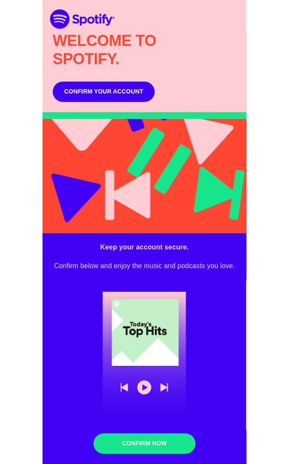
Throughout all of their marketing and app design, Spotify successfully uses flat design and geometric shapes. In this welcome email from Spotify, you can see the shapes used in the form of the play and pause buttons, along with how the email is divided into rectangular sections. Spotify, especially in their app, has been a long time follower of the flat design trend and has seen much success with it as one of the most popular music streaming apps.
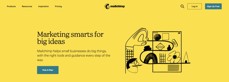
Mailchimp uses illustrations wonderfully in their branding and on their site. On Mailchimp's home page, there always seems to be a beautiful illustration accompanying their key messaging. The illustrations, all in the same quirky style, continue as you scroll throughout their site to highlight important sections, and build the brand's visual personality. Even as Mailchimp has grown into an industry powerhouse and matured as a company, they've always used illustrations. Though the styles may change, to help give a personal, hand-crafted touch to their products and services.
Elevation's Favorite Evergreen Design Trends
Simplicity
It is a unique challenge to distill information and visuals down to what communicates the ideas best. My first semester design professor told me I needed to learn to K-I-S-S (Keep It Simple, Stupid) and that lesson has always stuck with me.
Geometric Shapes + Infinity Shapes
I will always be mesmerized by infinity shapes. There literally is no more basic building block in design than geometric shapes. With these you can build anything or use them to mask images or text in unexpected ways.
Creative Typography
This is a deliberately broad category. We love it when words with their inherent definitions are extended into art forms that add other layers of meaning. The new renaissance that hand lettering and sign painting is experiencing speaks to the need for creative typography.
Color Pops
As children of the 80's and 90's we don't shy away from color.
3D
This was what the studio was known for originally. Stephen's 3D talents quickly evolved into amazing compositing, editing, and directing skills to boot. 3D will always hold a special place in our hearts. We love the use of materials, textures, and lighting for creating everything from hyper-realism, utilizing the latest render engine technology, to more playful elastic character designs. The only rule is that it should enhance the design and delight the viewer.
How You Can Incorporate Evergreen Design Trends Into Your Branding
- Work to understand your brand and your audience to determine the mood you want to invoke. Elevation Example: Nick Wild Card Game design direction. We utilized several design trends (Color Pops, Pattern, Monochromatic and 3D) with the best of Nickelodeon’s signature elements like vector-based animation and of course, slime. The end result was playful, fun, and completely on brand.
- Pivot - do a 180°. We were concepting digital key-art designs for E! Network’s “Dating No Filter” and we knew the brand and audience were young, trend-conscious individuals. That knowledge influenced the color palettes and themes, but when it came to the “story,” the client loved the iconic statuary treatment of a skewered cupid. Sometimes, the best fit is something unexpected.
- Highlight a single element. When we were approached to create a quick introductory video for Master Card’s Accept & Save feature, we knew we wanted to let the ampersand guide the design. It influenced everything from the script writing (by coming up with great pairings), to the playful animation. Even the simple line illustrations were motivated by the ampersand’s continuous line.
- Be consistent. The award winning branding we worked on with Scripps Networks for “Escape” includes several design trends that are unified with a consistent motion theory for the logo. The logo’s “escaping” P is integrated consistently in every instance from footage, to 3D, to dynamic fluid effects.
- Less is more. This comes back to the idea of simplicity and refining visuals to only what needs to be there. Several years back we were asked by TNT Latin America to come up with one look for all of their Awards Shows for the year. In previous years, The Oscars, The Grammys, The Screen Actors Guild, etc. would each have their own unique graphics package. We distilled the Awards Show look down into a kinetic art sculpture with light bulbs. Marquee theater signs, flash bulbs from paparazzi cameras, set lighting for concerts; they all feature light. We were influenced by kinetic art sculptures that were trending from across the globe like the BMW Museum in Munich and the “Kinetic Rain” sculpture in Singapore’s Changi Airport Terminal 1. The end result was an orchestrated wave of light that really aimed to match the elegance of the events even if it was a simple light bulb.
Conclusion
The world is always changing and trends are always coming and going. There are many more trends out there that this post didn’t cover and there will be many more in the future. As designers and creators it can be stressful to keep up with these evergreen design trends but it is also eye opening and fun to be able to utilize them to the best of our abilities.
Learn more about design and visual storytelling in these articles.
Topics: visual storytelling